Kirby Ward Fitzpatrick Prize
The Kirby Ward Fitzpatrick Prize (KWF Prize) is awarded annually by the Architectural Foundation of San Francisco, in recognition of the best new building completed in that year, designed by a small firm in San Francisco, and is named in honor of SF architect Kirby Ward Fitzpatrick (1935-1988) whose own award winning designs include the Peralta Elementary School in Oakland (with Dan Solomon). During the time his office was at 447 Sutter Street, he also designed many private homes including one in St. Helena, which was published in Architectural Record Houses. The KWF Prize was made possible by his estate in order to recognize excellence in small architectural practices.
Inaugurated in 2005, the first KWF Prize was awarded to Jim Jennings for his design of the Visiting Artists Studio at the Oliver Ranch in Geyserville. The award, along with a check for $2500, is presented to the building’s architect at the AFSF’s Annual Awards Breakfast each May.
2019 Kirby Ward Fitzpatrick Prize
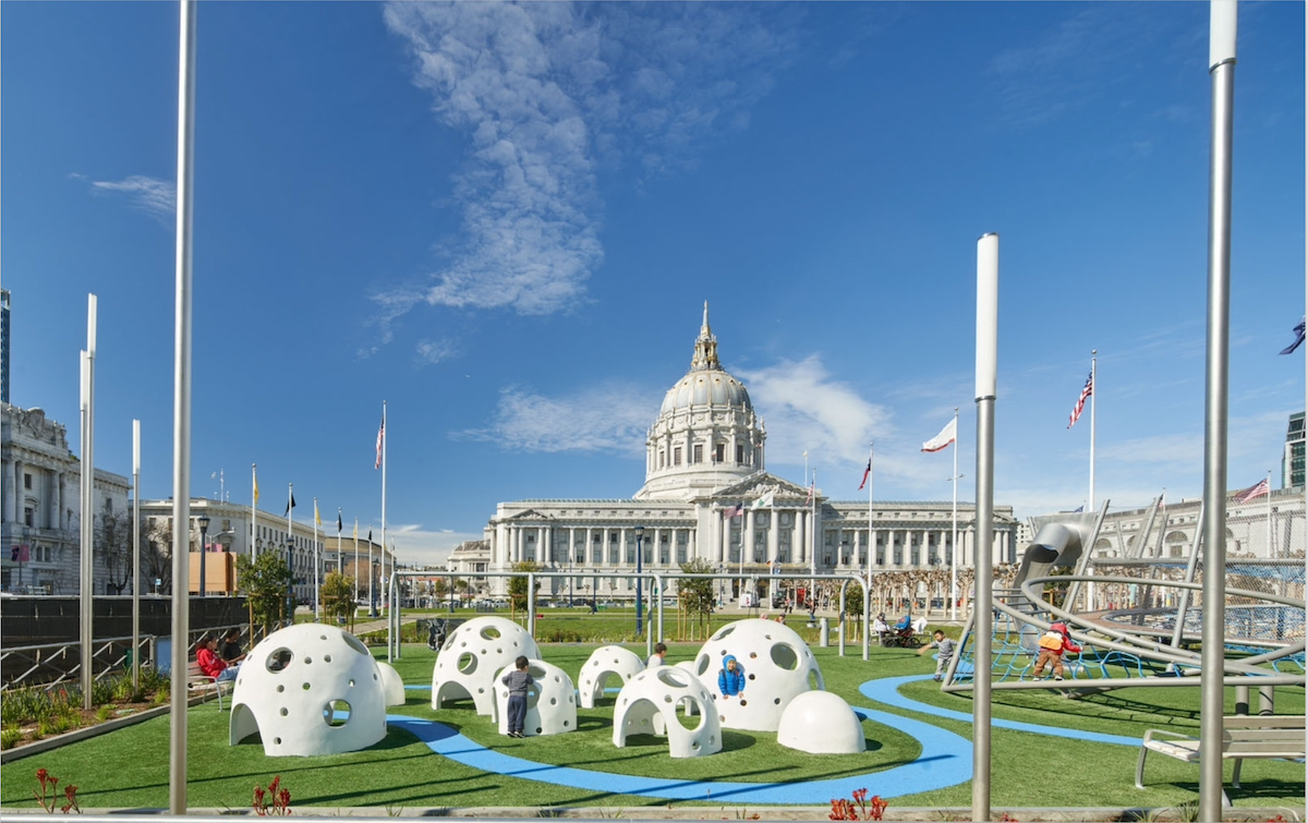
The newly renovated Helen Diller Civic Center Playgrounds, in the heart of San Francisco’s Civic Center Historic District, create a fun, lively space for the growing number of families in the densely populated Civic Center and Tenderloin neighborhoods. These vibrant playgrounds anchor the larger Civic Center park outside of City Hall, a hub for major public and cultural events. The site is surrounded by notable institutions with programs for children including the Main Library, the Asian Art Museum, and the San Francisco Symphony.
Award-winning SF based firm Andrea Cochran Landscape
Architecture (ACLA) designed these two new playgrounds for the Trust for Public Land in partnership with SF Recreation and Parks, and with a generous donation from the Helen Diller Family Foundation, based on extensive engagement with parents, children, educators and other community stakeholders. The new playgrounds are symmetrically aligned with City Hall, inspired by nature and weather themes, and include custom designed play features. One of the largest interactive floor light installations in the nation complements the new playgrounds and activates the adjoining space, representing the next generation of integrating public art and community engagement in public spaces.
Past winners
2018 Kirby Ward Fitzpatrick Prize
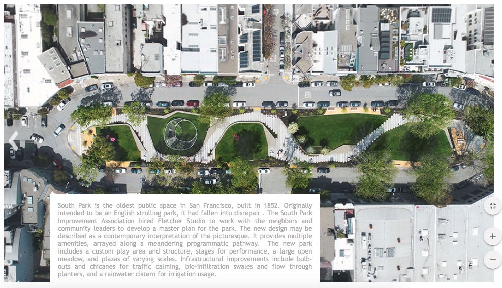
South Park St. @ Jack London Alley
David Fletcher, Fletcher Studio
South Park is the oldest public space in San Francisco, built in 1852. Originally
intended to be an English strolling park, it had fallen into disrepair . The South Park
Improvement Association hired Fletcher Studio to work with the neighbors and
community leaders to develop a master plan for the park. The new design may be
described as a contemporary interpretation of the picturesque. It provides multiple
amenities, arrayed along a meandering programmatic pathway. The new park, designed using cutting edge parametric software to create 3D models, includes a custom play area and structure, stages for performance, a large open meadow, and plazas of varying scales. Infrastructural and sustainability improvements include bulbouts and chicanes for traffic calming, bio-infiltration swales and flow through planters, and a rainwater cistern for irrigation usage.
2017 KIRBY WARD FITZPATRICK PRIZE
Mercy Housing
200 6th St. @ Howard
Owen Kennerly, Kennerly Achitecture + Planning
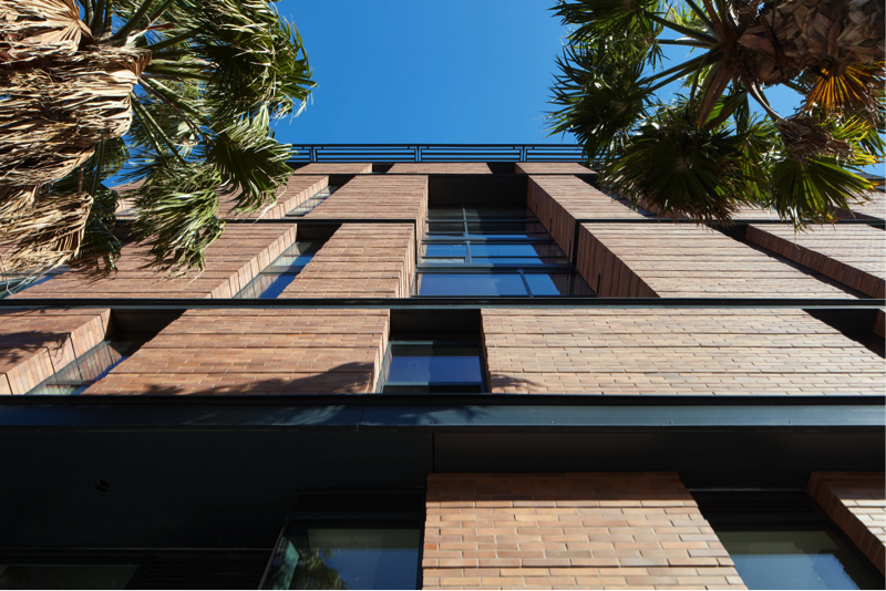
This nine-story mixed-use project with 56 units of affordable family housing replaced a burnt-out brick building that had been abandoned since the 1980s, and was acquired by San Francisco’s redevelopment agency in a rare use of eminent domain.
A double-height retail space on the corner and a grand lobby with an open stair give the building its street presence. “I grew up in New York City in an apartment building with a beautiful lobby, and it makes people feel like the building has an identity, that the building is proud of itself,” said Owen Kennerly, who worked for architect and affordable housing advocate Daniel Solomon before starting his own firm. Saida + Sullivan Design Partners collaborated with Kennerly on the project. In addition to a roof deck, most units along Sixth Street have living room balconies. All corridors are daylit; half terminate in internal balconies, enabling double-height spaces facing Howard. Laundry rooms located at these junctions take advantage of the natural light.
The exterior features modern versions of bay windows, which, combined with the balconies give it a “juicy richness in terms of shade and materiality,” said Kennerly. “It’s really important to us to have good architecture – all it takes is one ugly affordable housing building and people will say they don’t want those projects in their neighborhood,” said Olson Lee, the redevelopment agency’s deputy executive director. The agency is also pleased that the design followed guidelines for new development in a historic district (the area is expected to become the “Sixth Street Lodging House District”), and breaks up the mass into two volumes, starting taller at the corner and stepping down further along the block.
2016 KIRBY WARD FITZPATRICK PRIZE
DREAM:shop
Minna Alley, SoMa
Andrew Dunbar, Interstice Architects
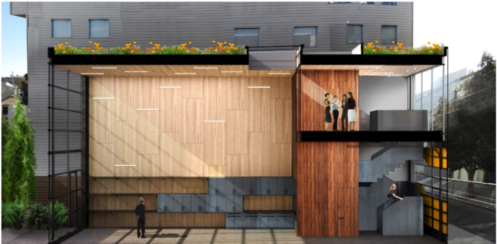
The DREAM:shop is a minimalist “open-ended” event space for an avid maker-client and his creative partners to experiment and ideate. Located in the central Mission, this simple plywood lined tube serves as a hybrid space for office, event space, laboratory and workshop, organized around a single three level vertical service core of reclaimed myrtle. The unencumbered volume integrates circulation, aperture, glazing and high performance systems to prioritize flexibility for future change.
The original Auto repair garage building was mostly demolished to allow the new generously “open” tube-like volume to connect the street to a private outdoor workspace in the rear yard. Maximizing glazing on both ends allows natural light and passive cross ventilation, including a fully retractable skylight at its core where one can access a native meadow roof garden.
This core vertically consolidates the functions of mechanical room, wet-lab, kitchen and bathrooms. Accessed by a sculptural twisting stair, this 3-level column allows the mezzanine office to be isolated from the workshop volume with glass curtains at two strategic locations. The smooth glass street facade de-materializes the dense urban fabric in which it is inserted, creating a shimmering void reflecting the sky by day and a glowing interior by night, while seamlessly integrating both vehicular and pedestrian access from Minna Street.
Walls and ceilings are laid out in a rational full sheet plywood pattern to minimize waste. Light tracks are introduced into the joints in a randomized pattern to allow flexibility of future program possibilities and a myriad of light types, from orient-able spots, floods, pendants and line voltage theatrical spots, to plug-in projectors and accessories. Six oversized dimmable high intensity industrial fluorescent fixtures float like balloons in the prismatic void – an unencumbered volume which integrates circulation, aperture, glazing and high performance systems to prioritize flexibility and future change all within a clearly defined space that breathes natural light in constant dialogue with the sun and the ever changing seasons.
SITE: Mission District, San Francisco, CA
SCOPE: Studio, Office, Workshop
2015 Kirby Ward Fitzpatrick Prize
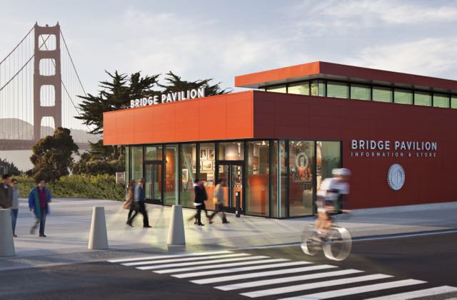
Golden Gate Pavilion
Jensen Architects + Project Frog
Golden Gate National Park Conservancy as clients
Jensen Architects joined Project Frog, an innovator in prefabricated building systems, to design a new visitors center on short notice for the 75th anniversary of the Golden Gate Bridge. The new pavilion was needed to house interpretive exhibits, an information center and retail store. The goal of the collaboration was to make a modern structure that complements the historic setting, and to deliver it in months instead of years.
Designing with Project Frog’s prefabricated building systems is like solving a complicated, 3D puzzle. Most of the Project Frog components came from their standard kit, but some were created specifically for the Golden Gate Bridge project: a roof monitor module for enhanced natural light and a glass corner unit for a refined sensibility. The uniform nature of these components — from wall panels to ceilings, from door frames to girders — suggested and reinforced the pavilion’s geometry and shape.
The construction, from start to completion, was roughly three months. All components were fabricated off-site and quickly assembled on-site. The site became a test bed for this new iteration of Project Frog’s kit, a more flexible core and shell system capable of expanded building sizes and even multi-story designs. The system’s success — an award-winning design delivered in record time and under budget — opens the way for expanded applications, for commercial space, schools and even medical offices.
The finished building is the color of the bridge itself, International Orange, a nod to the building’s prominent location and the anniversary it was designed to celebrate. The innovative, vibrant pavilion introduces visitors to the bridge, its history, and the Bay. It responds to the massing of other buildings on the historic site while standing out as a new civic amenity with its own strong identity.
2014 KIRBY WARD FITZPATRICK PRIZE
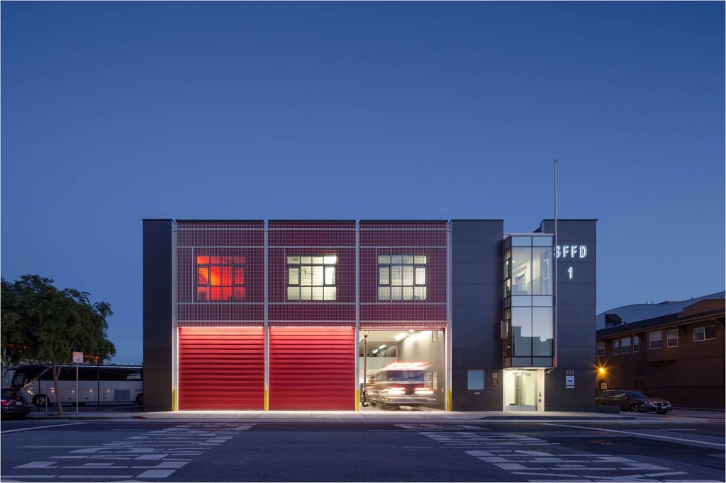
Firehouse Number 1
LMS Architects
SFMOMA, SFFD and SFDPW as clients
Firehouse No. 1 is the first new firehouse built in San Francisco since 1970 – a gift to the City by the San Francisco Museum of Modern Art (SFMOMA) as a part of the museum’s expansion project a few blocks away. One of the busiest stations in the western U.S., Firehouse No. 1 is also one of the healthiest and most energy-efficient, integrating a variety of strategies to ensure resiliency, conserve natural resources, and provide healthy indoor environments for the firefighters. The project is designed to use 40% less energy than the US average for firehouses.
Firehouse No. 1 is a unique urban hybrid: the result of an innovative private/public partnership between SFMOMA and the City of San Francisco. The building is simultaneously an important civic structure, a resilient emergency facility, and an inviting home for firefighters.
2013 KIRBY WARD FITZPATRICK PRIZE
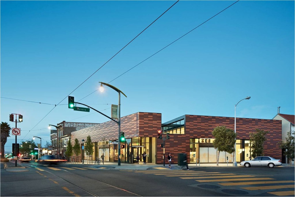
Bayview Branch Library
Karin Payson
in association with THA Architects
The Bayview Branch Library is the third successful library designed in collaboration between Karin Payson and THA. Having renovated and expanded the West Portal Branch and the Parkside Branch, Bayview was initially intended to be another renovation and expansion. After Payson’s colleague at THA, Kacey Jurgens (the architect of record for the library), did a series of conceptual design studies to test the expansion of the existing building on two floors, they decided the library needed to be all on one floor, and they convinced the Library Commission to purchase the adjoining site and demolish the existing library to build a new one.
The exterior skin was chosen by THA for its emulation of textile patterns, inspired by Kente cloth. The interior materials were developed according to a combination of a distinct design aesthetic, a focus on low-VOC and sustainable products and the requirements of the library. They created spaces that maintain dignity while being easily maintained, even if defaced.
Following a design process that invited and incorporated the input of neighbors and other community stakeholders design, the final design won not only accolades from the City and the design world, but from neighbors and library users as well.
2012 Kirby Ward Fitzpatrick Prize
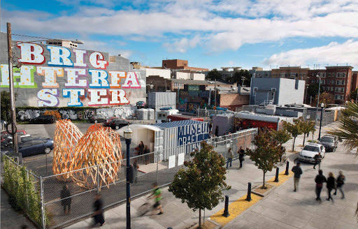
PROXY Hayes Valley, San Francisco
Douglas Burnham, Adjunct Professor and principal of envelope a+d
A placeholder for a more permanent development, proxy is a temporary two-block project that creates a centralized, ever-changing experience in the heart of a San Francisco neighborhood in transition. Transforming vacant lots on the former site of an elevated freeway, proxy is a new model for urban development: recasting underused urban areas into thriving cultural con-structs. A content machine, tied to the pace of contemporary culture, proxy embraces the city’s vast diversity and encourages the rotation of new ideas, start-up business, and innovative art installations. Here events, retail spaces, art and even food offerings rotate through proxy’s open framework of temporary structures, invoking a flexibility between people, architecture, and the city. Operating under the motto HERE FOR NOW, proxy is an investigation into the potential of impermanence: stressing the importance of presence, heightened engagement, and seizing the moment.
2011 KIRBY WARD FITZPATRICK PRIZE
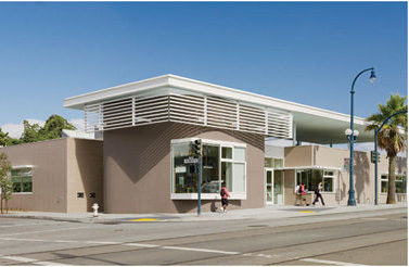
Ingleside Branch Library
Fougeron Architecture with Group 4 Architecture
“Building better libraries for stronger communities” – San Francisco’s ambitions were on the minds of the architects responsible for a branch on a corner lot on Ocean Avenue. Anne Fougeron, principal of the eponymous firm that designed the $3.5 million building library along with Group 4 Architecture in the Ingleside neighborhood’s main commercial strip, aimed to distinguish the library from the surrounding jumble of residential and commercial buildings with a “grander scale” that belies its true size. The interiors are uncluttered and cleanly modern, with tightly coordinated components and intriguing elements that Fougeron refers to as “little moments to spark a child’s imagination.”
2010 KIRBY WARD FITZPATRICK PRIZE
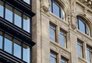
1 Kearny Street
Office of Charles F. Bloszies AIA
An amalgam of three buildings, one new and two existing forms a new single office building with retail uses on lower floors, The original French Empire style building was constructed in 1902 and survived the 1906 earthquake and fires. An Annex was constructed in the mid-1960’s, one of Charles Moore’s first designs. The new building takes cues from both styles while inserting a contemporary timestamp. A richly textured glass and aluminum facade, tempered by terra cotta panels, contrasts the nearby buildings in the architecturally conservative downtown historic district.
2009 Kirby Ward Fitzpatrick Prize
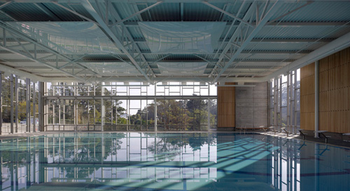
Sava Pool
Mark Cavagnero & Paulett Taggart
This joint venture between Mark Cavagnero Associates (MCA) and Paulett Taggart Architects (PTA). MCA was responsible for the concept and the exterior shell while PTA was responsible for the interior architecture and systems.
Driving southbound along a particularly busy stretch of 19th Avenue in San Francisco’s notoriously fogged-in Sunset District, it’s easy to miss that moment when the streetscape changes. The to the north. It’s as subtle of a transition as how the road itself gradually crawls and falls, echoing the undulating sand dunes that pre-dated the development of this part of the city.
If you look more closely, a grey horizontal building emerges, nestled close to where the hard-edged gridiron of two-story pastel colored houses gives way to an expansive open space. A protected courtyard leads alluringly into an expansive, light-filled natatorium. Inside, windows on all four sides frame the surrounding views of Stern Grove. The option for natural ventilation on temperate days is provided by low operable windows for intake and high operable windows for exhaust. A finely articulated curtain wall pulls in light and warmth that floods through the southern exposure while operating in tandem with a series of skylights, roof monitors, and a sunscreen that diffuses and shapes the light within. Cedar wood slats over acoustical material create a comfortable environment for the swimmers and hand-crafted ceramic tiles in a bold blue color create an enclosure for the pool equipment.
Durable, climate-appropriate materials such as cast-in-place concrete and aluminum fenestration take on monumental characteristics as they define and protect the civic space. Not only is this designed to be a functionally and programmatically excellent pool to withstand decades, if not generations of continuous public use, Sava Pool has come to serve as The City of San Francisco Recreation and Parks Department’s model for subsequent pool remodel criteria. As a tangible indication of community respect, despite numerous buildings nearby being targeted for graffiti, this pool building has never been vandalized.
2008 KIRBY WARD FITZPATRICK PRIZE
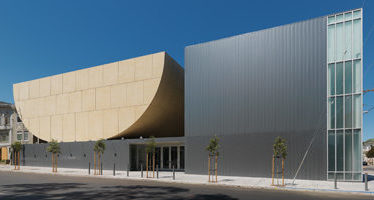
Congregation Beth Sholom
Stanley Saitowitz/Natoma Architects Inc.
The site is in San Francisco, in the flat Richmond district, at the intersection of Park Presidio and Clement Street. An early plan established a pair of religious structures as gateposts along this boulevard. One is the strong presence of the Neo-Classical Christian Science Church. The other is Congregation Beth Sholom, where an old synagogue was demolished to build this new building.
The new building is positioned on a plinth. Here all the non-religious programs of the campus are contained. On the plinth two buildings are placed, forming a courtyard. One is a reflective cube, the social hall, the other a masonry structure, the sanctuary, a vessel floating in air.
In the neighborhood, the building marks the corner with a thin tower like slice. This corner building, in contrast to the solid masonry sanctuary, is reflective and light. Although small in comparison to the many large towering and domed religious structures in various neighborhoods of the city, this building, by design, marks Congregation Beth Sholom.
The building is both ancient and modern, drawn from traditions and texts in the hope of revitalizing the present.
2007 KIRBY WARD FITZPATRICK PRIZE
La Cocina & Folsom St. Housing
Paulett Taggart
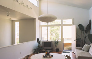
Located within an established residential area of San Francisco’s Mission District, the Folsom Street Housing & La Cocina is composed of three residential townhouses organized around a landscaped courtyard and a new non-profit commercial “Kitchen Incubator” which trains low-income women working to develop viable catering businesses. The kitchen facade, fronting Folsom Street, speaks to the commercially scaled functions within, while relating to the more delicate, residential scale of its surroundings. Behind it, three townhouses surround a secure internal courtyard that serves as a shared “front yard” for the units, and connects to the street via a gated pedestrian path. The houses are scaled to the smaller “alley-sized” buildings of the neighborhood. Each provides a garage, study, workspace or second bedroom downstairs, and a main living, dining, kitchen and bedroom upstairs.
2006 Kirby Ward Fitzpatrick Prize
Visiting Artist Studios
Jim Jennings
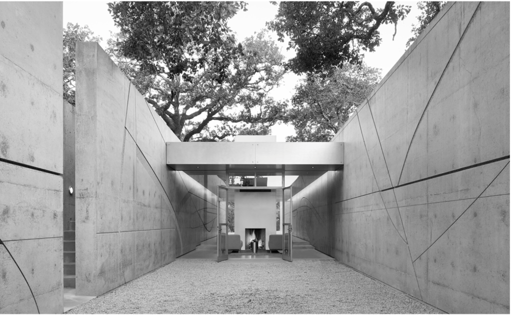
The Visiting Artist Studio won numerous awards in addition to the KW Fitzpatrick Award, including the Institute Honor Award for Architecture whose judges wrote: “The powerful design gets its strength from a simple palette of materials, scrupulously detailed and highly crafted…The facility’s lighting allows the structure to glow from within, warming and softening the austere concrete… Two nearly parallel concrete walls create a dialogue between architecture, landscape and art.”
The building, located on a hillside, is owned by an art lover and patron who wanted a house worthy of sculptures by Richard Serra, Bruce Nauman, Martin Puryear and others and host artists commissioned to produce new artworks. In short, a “visiting artists’ house”.
Jim Jennings‘ work, a sculpture among sculptures, draws its strength, form and inspiration from two 60 metre cement walls, imposing and yet slender, which run along the hill in seemingly parallel lines. In fact, they diverge at the north end and converge at the south end, creating perspectival phenomena expressed with the force of a poetic gesture. Architecture here is more like an engraving than a building. Here, on the hill in Geyserville, architecture, the plastic arts and poetry come together in one of their most successful joint efforts.
